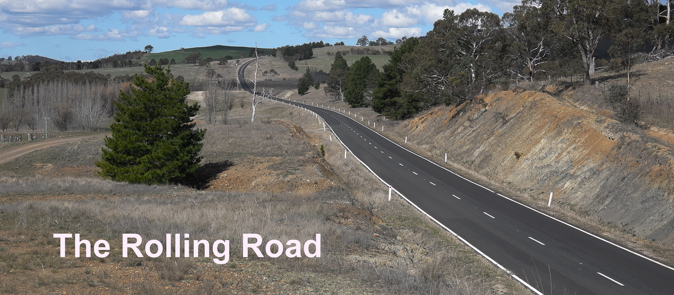

Otto,taken on the Leica X1. Apart from some cropping it is exactly as the jpeg file came out of the camera with no processing.
But that's not really relevant. I just love the photo and in particular its soft and natural colour rendition.
The odd thing is that it seems that so many people do not like the soft natural look on their photos.In the recent post Scott's photos of Africa have the same soft look but nowadays many people expect a more saturated,contrasty and "sharper" look.
If you go into a electronics store's TV sales area where there are banks of big screen TVs turned on you can see that most of them have very strong saturated colours and many have extreme sharpness -almost as if a knife had been run along the edge of objects on the screen.
Apparently many TVs actually have a "store" setting which gives the high saturation/high edge sharpness look for store display.
I used to get this same edgy sharpness with black and white film using a high definition developer which gave this edge effect.And you can,of course,add it to your photos in photo editing software by overcooking the sharpness tool.
I am told that some brands of camera have different jpeg image processing software for the Chinese market so that the photos have more pronounced edge sharpness and a richer red/orange/yellow colour palette.Presumably this is because their Chinese buyers expect their photos to have the same characteristics as their TVs and phones/tablets.
This is not a new phenomenon.Kodachrome gave the world a very strong saturated look to colour slides and we all,me included,loved it so perhaps what we are seeing with the saturated edgy look is just Kodachrome updated.
No comments:
Post a Comment